

CTR optimization conversations often jump to titles and PPC bids. But on Amazon search results, the main image is the ad - it is the only creative most shoppers see before deciding whether to click. A listing with weak CTR on high-volume queries is often a listing with a main image that fails at thumbnail size, not a listing with wrong keywords.
This article is a visual before-and-after gallery from real catalogue work: compliant changes that improved click-through rate without violating Amazon's main image policy. Every example below started with search data - not creative instinct. For the monitoring layer, start with Amazon CTR Optimization.
Why the Main Image Is Your Highest-CTR Lever
Amazon's search results render your main image at roughly 150-200 pixels wide on mobile. At that size, shoppers cannot read bullet points. They process contrast, shape, pack count, and brand recognition in under a second. The algorithm notices the same signal: higher CTR relative to impression position reinforces relevance and earns better organic placement over time.
Your main image does two jobs at once: it wins the click and sets up the sale. Even a small lift on either side compounds into meaningful revenue on traffic you already paid to generate. That is why changing main images on vibes alone is expensive - you are guessing on the highest-leverage creative in the funnel.
The examples below share one property: every change stays inside Amazon's main image rules - pure white background, product as the focal point, no digital text overlays. The gains come from better staging informed by what shoppers actually search for, not rule-breaking.
SQP-Driven Images: Data Beats Vibes
The smarter workflow is straightforward:
- Pull recent search query performance (SQP) or search term data for the ASIN
- Identify what shoppers care about most on high-impression queries
- Turn those signals into specific image elements - not generic "make it pop" briefs
- Stage, shoot or composite compliant main images around those elements
- Test properly via Manage Your Experiments or before/after CTR monitoring
AI accelerates the middle steps - pattern recognition across query clusters, brief generation, rapid concept iteration - but the input has to be real buyer data. Without SQP, you are optimising for what looks good in a design review, not what wins clicks in search. For the full analysis workflow, see How to Analyze Your Amazon SQP Report with Claude.
Case study: above-ground pool with dome (EXIT Toys)
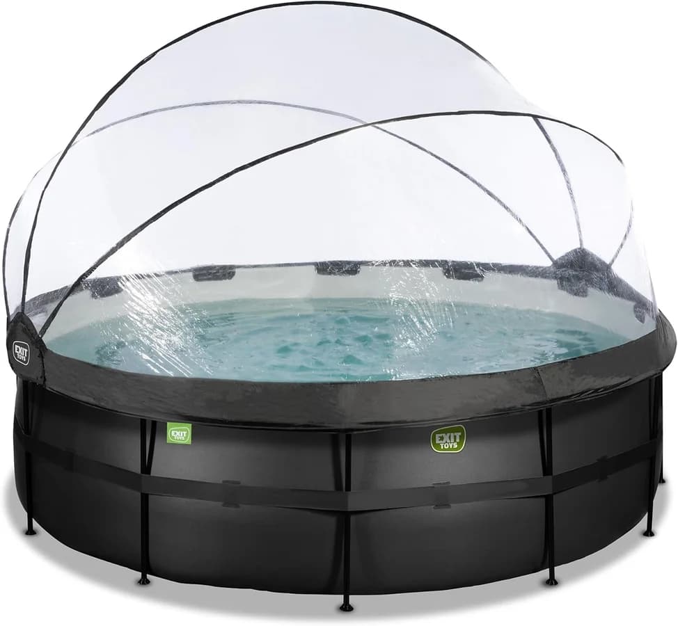
The before image is a clean studio shot - pool, dome, water. Policy-perfect and commercially flat. SQP data told a different story: queries around filter pumps and included accessories showed extremely high buyer intent relative to generic "above ground pool" head terms. Shoppers searching those terms were not browsing - they were comparing complete sets. Showing the pump in the main image was a no-brainer once the data was visible.
Before
After
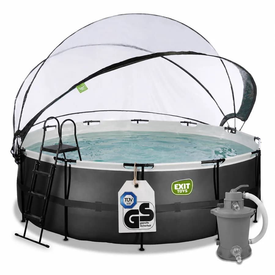
Left: generic product shot. Right: SQP-informed staging - filter pump visible for high-intent accessory queries, physical GS/TÜV safety hang tag for trust-driven clicks.
The pump: high-intent SQP signal → staged in-frame so comparison shoppers see the complete package without clicking through. This is not decoration; it answers the exact purchase question driving impressions.
The physical safety tag: one of the most underused compliant CTR techniques in hardlines categories. Amazon's policy prohibits digital text and badge overlays on main images - but a physical hang tag attached to the product (here, GS and TÜV SÜD certification) is part of the product presentation, not post-production graphics. At thumbnail size it communicates safety certification faster than any bullet point - and it survives compliance review because it is real merchandise, not a Photoshop layer.
The after image also adds the ladder and tightens the overall staging so the dome, pool, pump, and tag read as one complete system. Same product. Same white background. Different information hierarchy - driven by search data, not a designer's gut.
Packaging and Brand Signal in the Frame
Generic product-on-white photography is policy-compliant and commercially invisible. When your physical packaging carries strong brand equity, showing the retail pack in the main image often lifts CTR because shoppers recognise the product as a branded item, not a commodity listing.
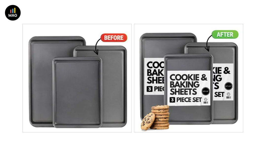
Baking sheets: before shows bare product only. After adds compliant packaging sleeves with size callouts and a small cookie stack for scale - brand and set contents readable at thumbnail.
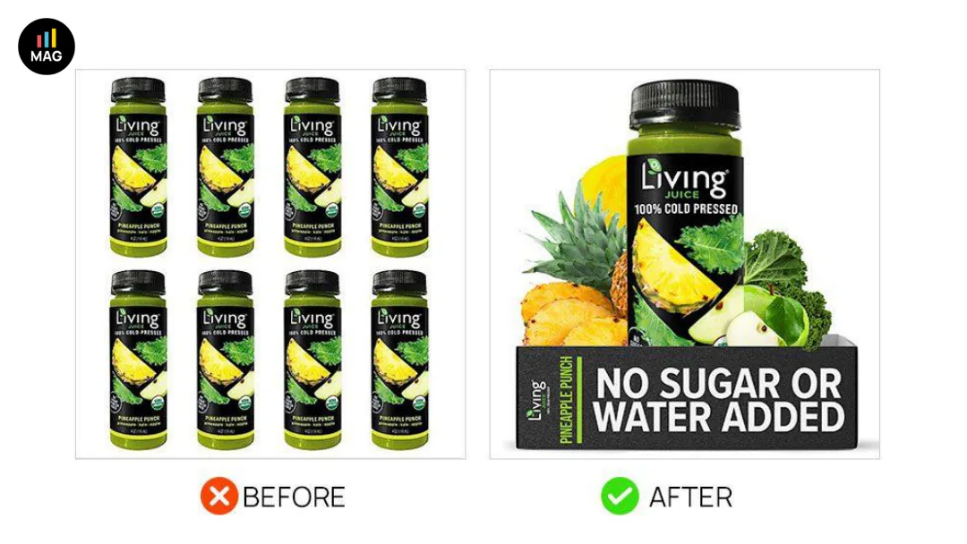
Packaging-forward staging: the after image communicates brand and variant through the physical pack design already on the product - no added text overlays required.
Lifestyle Props That Add Context Without Breaking Rules
Amazon allows props that provide scale or demonstrate use - as long as the product remains the focal point and the background stays white. The goal is not a lifestyle scene; it is one or two contextual objects that answer "what is this?" faster than the product alone.
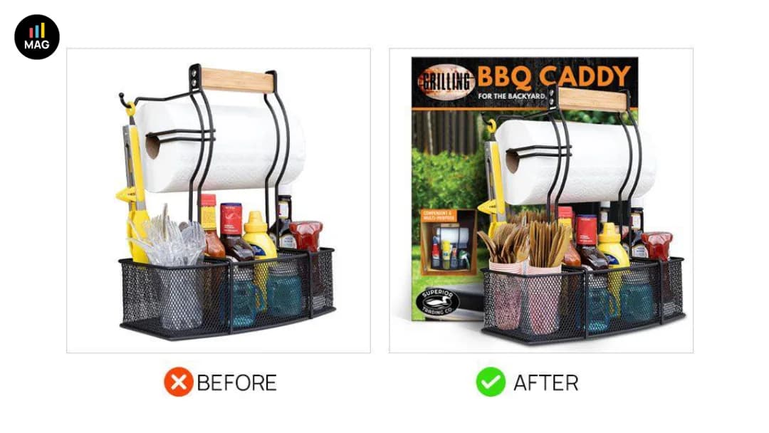
BBQ caddy: before uses generic plastic utensils. After swaps in cohesive props and shows retail box edge for backyard context - higher click appeal without leaving the white-background format.
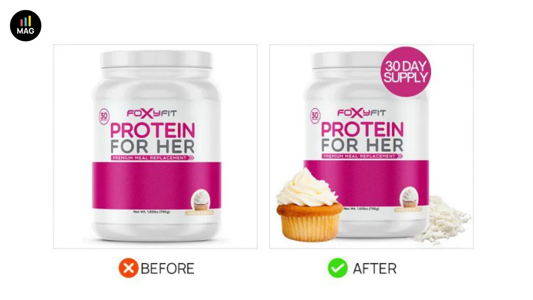
Controlled prop upgrade: replace low-quality accessories with cleaner, category-appropriate items that signal use case at a glance.
Multi-Unit Staging and Set Communication
Multi-packs and bundle listings fail CTR when shoppers cannot tell how many units they are buying. Staging every piece in the set - slightly offset, not cluttered - communicates quantity without text labels.
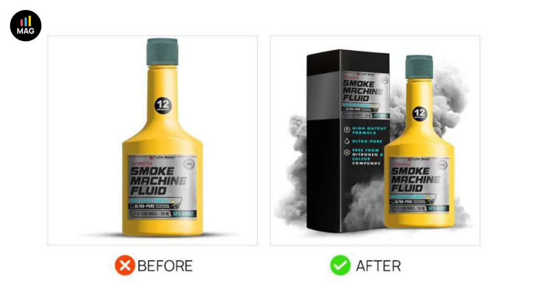
Set communication: after image shows each unit in the bundle with deliberate spacing so count is obvious at thumbnail size.
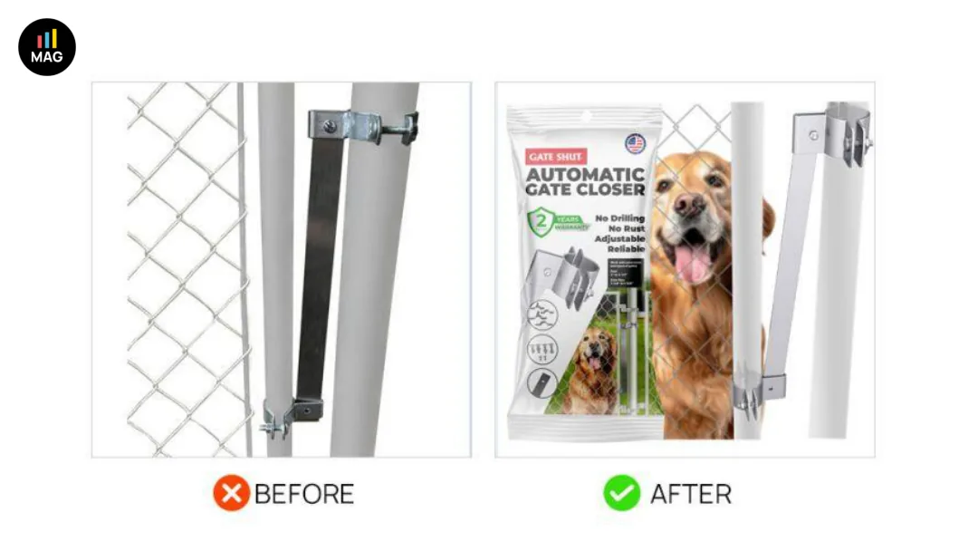
Multi-pack clarity: offset stacking beats single-angle shots when pack count is the primary purchase question.
Angle, Contrast, and Thumbnail Readability
Low contrast against white, flat lighting, and awkward angles make products disappear in search grids. Minor photography adjustments - slightly elevated angle, stronger edge definition, tighter crop - often move CTR without any packaging change at all.
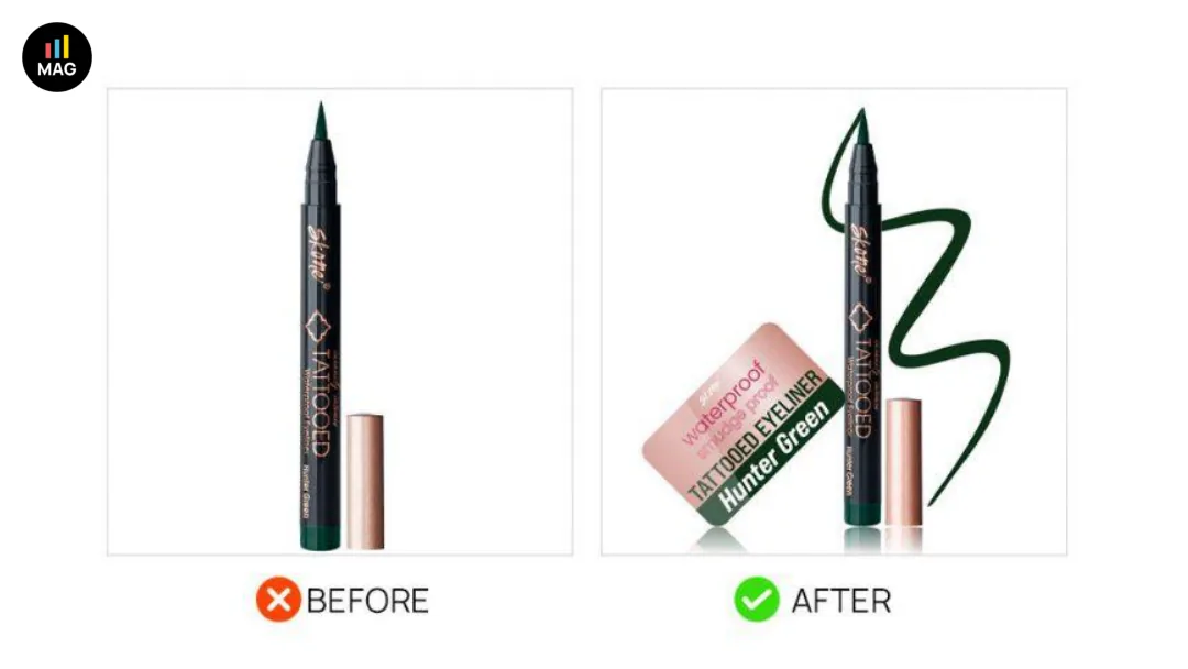
Angle and crop: after image fills more of the frame with cleaner edges - the product reads larger in the SERP thumbnail.
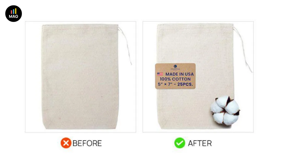
Contrast fix: darker products especially need edge definition; the after shot separates product from background so shape parses instantly.
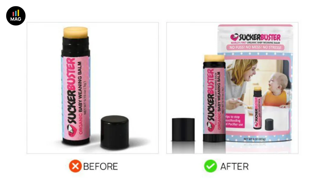
Lighting and position: even compliant studio shots age poorly - reshoots that modernise clarity compete better against newer catalogue entries.
Staying Inside Amazon's Main Image Rules
Every example above respects the core constraints:
- White background (RGB 255, 255, 255)
- Product fills at least ~85% of the image area
- No text, logos, badges, or pricing added in post-production
- No placeholder or "image coming soon" graphics
Branding must come from the product and its packaging - not overlays. Props must support the product, not distract from it. When in doubt, submit through Manage Your Experiments and monitor for suppression - policy enforcement on main images is inconsistent but painful when it hits a hero ASIN.
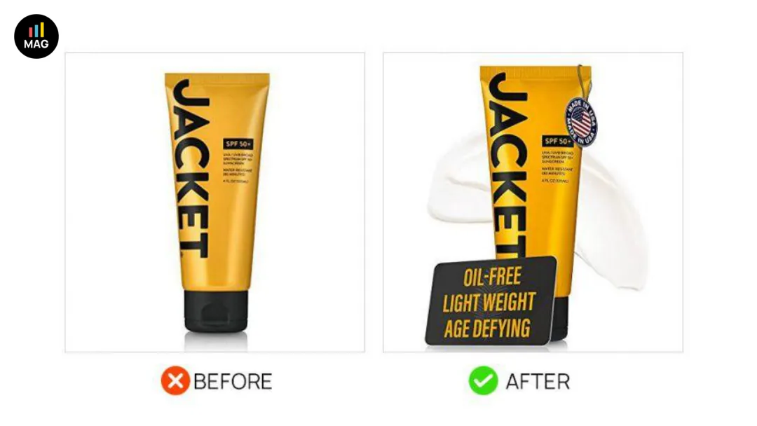
Compliance-safe win: all visual upgrades come from staging and photography - nothing that triggers main image policy flags.
Testing Main Images Across a Large Catalogue
One reshoot does not scale to 500 SKUs. Prioritise by impression volume × CTR gap: ASINs with high search visibility and below-median click share get the main image queue first. For each priority ASIN, pull SQP before briefing creative - the pool example above only worked because accessory and pump queries were already visible in the data.
Brand-registered sellers should use Manage Your Experiments; everyone else should at minimum before/after monitor sessions and CTR proxies in Brand Analytics after swaps. AI helps you generate and iterate image concepts faster; testing tells you whether those concepts actually move the two metrics that matter - click share and conversion setup.
At catalogue scale, the operational problem is not knowing what good looks like - it is applying a consistent standard across hundreds of listings and measuring whether each change worked. That feedback loop is what separates a one-time creative project from continuous listing optimization. Use the listing optimization checklist to score which ASINs need the main image queue this cycle.
Book a catalog scan - a 45-minute call where we look at your Amazon catalog, name the top three issues we'd attack first, and discuss whether a Pilot makes sense.
Book a catalog scan